What is Information Architecture (IA) and Why is it Important?
At Voice+Code, one of the biggest problems we uncover as a result of usability studies are issues with the website or application’s information architecture (IA). IA refers to how things are organized, structured, and named. Everything you do online requires you to take notice of, process, and interact with a website’s information architecture in order to find information or accomplish a task.
Users navigate a website the same way we all find where we need to go in the real world. Think about the last time you were in a busy airport or train station. You used clues to guide you to the correct terminal, through security, and to your designated gate. Those clues were probably a combination of familiar things you remember from airports you’ve been to, the familiarity of the airline logo and branding, information on your ticket, signage, and more. You follow each clue, moving forward as long as you’re pretty sure you are on the right path. Once you start second-guessing your choices and decide you missed a turn, you might backtrack or ask someone for help.
What is “information scent”?
Similarly, users will follow what the Xerox PARC research team coined “information scent.” In the digital realm, as long as our visitor believes she is on the right path—that the “information scent” is strong—she’ll continue along that path. Once she has lost the scent, and now assumes she’s gone down the wrong path, she backtracks to familiar territory or gives up. This is particularly frustrating to watch during usability tests when a user is so close to finding the information they need, only to retreat, having lost the “scent” and assuming the information isn’t on that page or simply doesn’t exist.
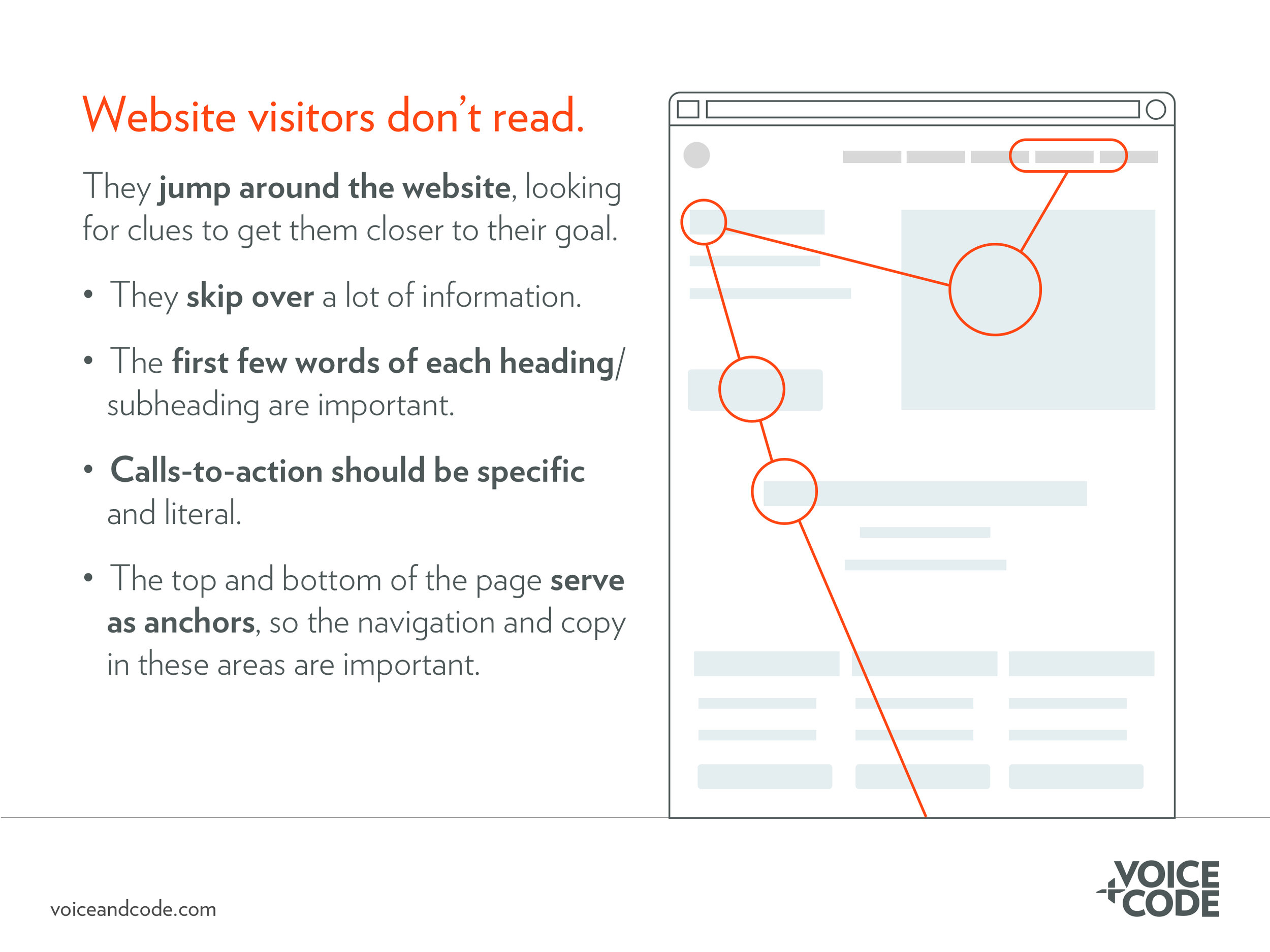
Whenever a user lands on a new website or opens a new application they use existing mental models and past experiences with digital products to make sense of where they are and what they can do. They ask, “where am I?” and “what can I do on this website?” On desktop websites, users often spend time looking at the navigation menu, using the names of the primary navigation items to provide clues as to what an organization does and what they can do on the website. They will then quickly scan the page, focusing on visually prominent information or graphics. This often includes, for example, large headers or bold and bright calls-to-action. Often, they get to the footer and again pause to see if it holds any relevant clues before they scroll back up again. They may even quickly scroll up and down the page several times, using the primary navigation and footer as anchors.
This common behavior is important. It tells us that users take notice of and rely on the primary navigation, footer, and visually prominent calls-to-action to get them where they want to go.
How to create a a user-focused information architecture
Understanding the above behavior and the concept that users rely on “information scent” is the first step to creating better digital navigation systems. But best practices will only get you so far—an ideal information architecture is unique for every digital product. That’s why it is so important to conduct research with actual or representative users. What makes sense to you doesn’t necessarily make sense to the people using the product. Below are common IA-specific user research methods that reveal users’ mental models:
Product analytics
Review analytics to see common pathways of people already using your site. This will tell you what users are doing—not why they are doing it. However, it is helpful in trying to narrow down where problems might be occurring and in creating hypotheses you can then test using the methods below.
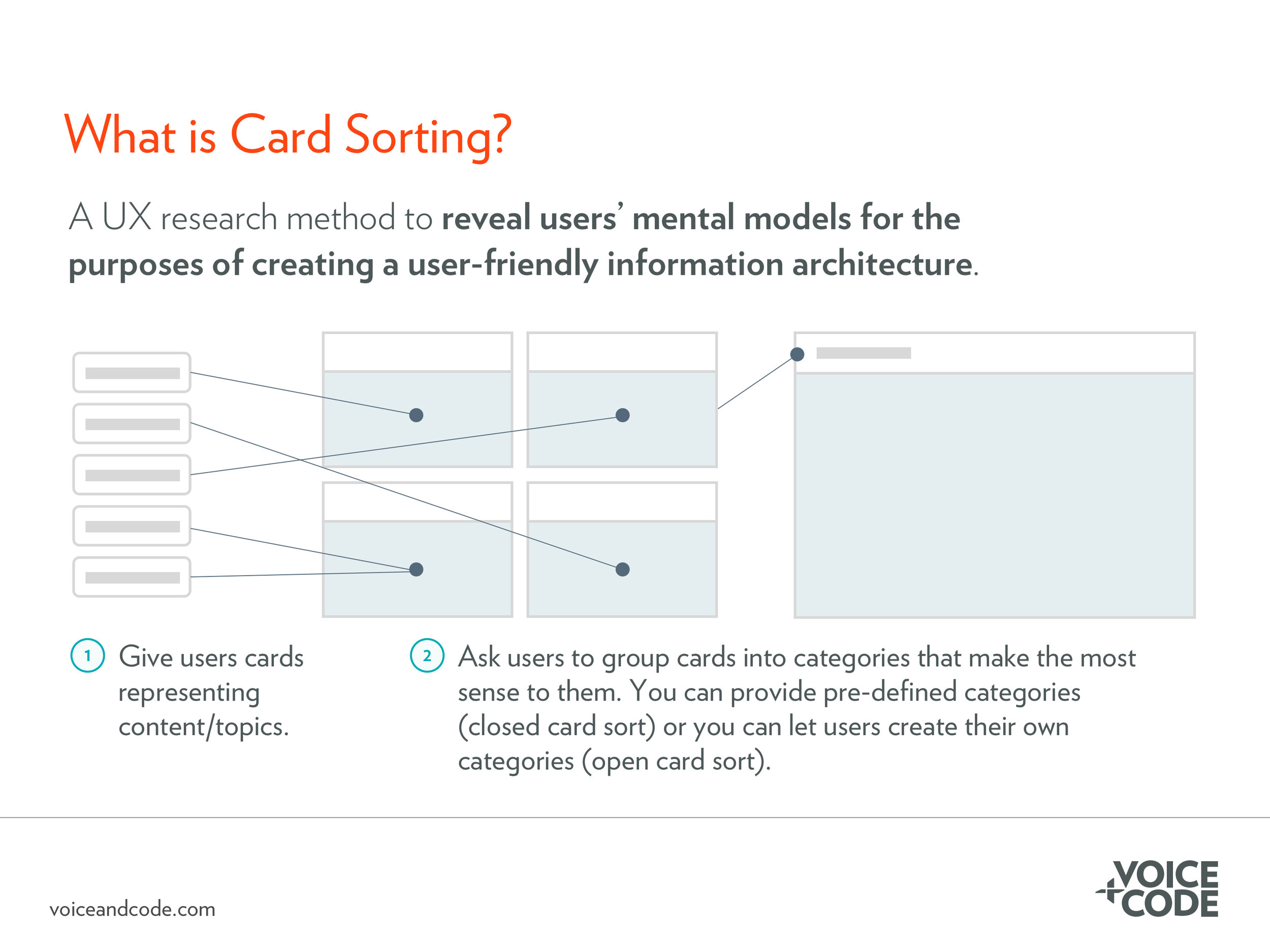
Card sorting
Card sorting is a low-cost, easy-to-conduct user research method used to understand how users would group information on your website, app, or other digital product. You can provide pre-defined categories (a closed card sort) or allow users to create their own categories (an open card sort). Ask users to group digital or printed “cards” into categories that make the most sense to them. In an open card sort, ask users to label those categories once they are done grouping them. While these can be done remotely, adding a moderator can help you understand why participants grouped the cards the way they did, giving you deeper insights into your users’ mental models.
Tree testing
Tree testing asks participants to perform pre-defined tasks using just the structure of the website—it’s separated from the context of the rest of page or any visual design. Like card sorting, tree testing is relatively easy to set up and usually takes participants less than fifteen minutes to complete using easily accessible online software. Based on the paths participants take and where they ultimately land, your team is able to get an understanding of how people look for information and think about performing tasks on your website or app. Setting up a tree testing exercise after card sorting is useful to see how the results of the card sort hold up when users are performing realistic tasks.
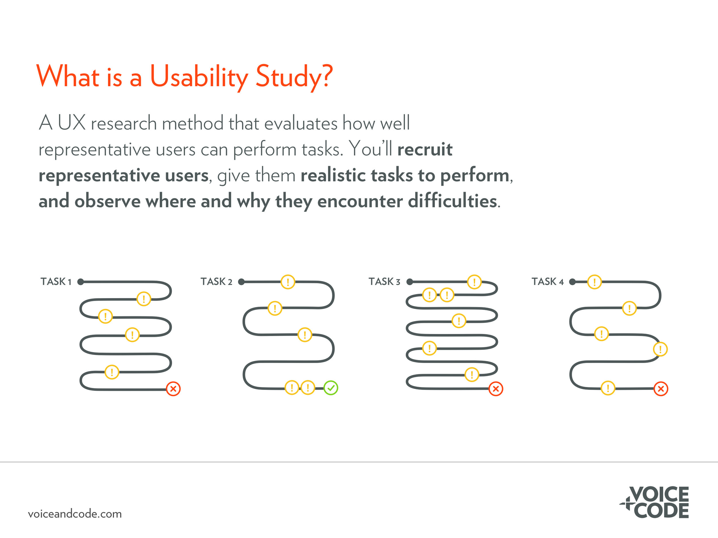
Usability studies
While not an IA-specific research method, usability studies allow your team to see how the information architecture and visual design play together to help users achieve their goals—or not. To conduct a usability study, have representative users perform a series of pre-defined tasks on your website. Through observation, you can uncover how users navigate your site and what roadblocks they encounter. Armed with data gleaned from observation and thoughtful follow-up questions, your team can decide how to optimize the site, remove roadblocks, and successfully encourage users down the ideal path.
Once you’ve completed the research, meet with your team to discuss the results. What patterns emerge? In the card sort, did all participants group the items similarly? Did different groups of participants have different mental models? How do these patterns differ from how the website is currently structured? What changes can you make to the information architecture to more closely match your users’ mental models?
IA Best Practices
As you revise your information architecture, integrate these IA-specific user experience best practices:
Pay careful attention to the name, order, and number of the items in your primary navigation. The primary navigation is very important in helping users orient themselves on your website, as well as helping them decide if your organization can help them achieve their end goal.
Don’t hide the primary navigation—in a hamburger menu, for example—when there is enough space to display it.
Don’t underestimate the value of information in the footer. Using the research methods above, determine what your users expect to find in the footer.
Ensure visually prominent items on the page contain contextual clues. Imagine they are the only things your users see as they scan the page. If users only read those—and that may be the case for some—can they get the basic idea of what you’re trying to communicate?
Similarly, ensure the first few words of visually prominent items communicate your message. Users may not read the rest of the sentence, let alone the whole paragraph.
Use breadcrumbs on websites that are three or more layers deep. They provide another helpful way for users to orient themselves, particularly on complex sites.
The next time you can’t find information on a website, consider what aspects of site’s information architecture are failing you. Think about how you navigate websites: you are a hurried website visitor, anxious to perform the task you need to perform and get out. Your users are the same way. By paying careful attention to the information architecture, you lay a thoughtful foundation for a website that helps your users—and your business—achieve your goals.