UX Best Practices: Form Design
Let’s face it. No one enjoys filling out forms. Forms can frustrate users and can lead them to abandoning the form—and website—altogether. This can be disastrous for your digital product if it relies on forms to move users to the next level of engagement. For example, a sign up or check out form. Thankfully, the following simple changes can encourage users to complete a form and help them submit it successfully:
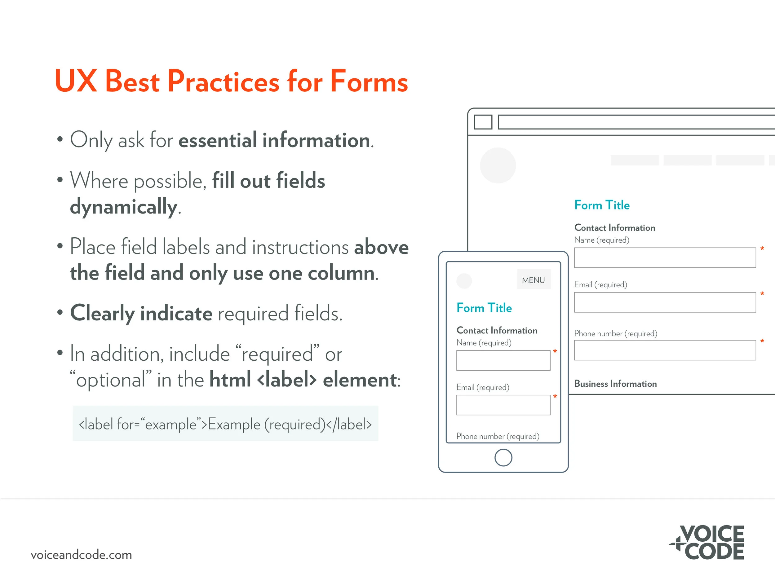
Only ask for essential information. Bloating your form with unnecessary fields deters users from completing it. If you are asking for personal information, explain why that information is necessary and what you are doing to protect it. A simple explanation is often enough to encourage users to complete the form.
Group similar fields into logical categories. For example, e-commerce forms often group fields requesting method of delivery, shipping contact information, and billing contact information. Help users understand what information you’re asking for by grouping similar information together with visually prominent headings to distinguish them.
Help users fill out the form. Many e-commerce checkout forms allow you to choose the same address you filled in for shipping to be applied automatically to the billing fields. Increasingly, forms can dynamically be filled out based on previous information (for example, filling in the city and state based on the zip code). On mobile devices, in particular, this helps users accomplish the task faster and with fewer errors.
Place field names above the field, not to the side or within the field. It’s easier for users to scan and fill out a form when the field labels are above the field, as opposed to the side. If you place the field label within the field, users may forget what the label said. Worse, they may mistakenly think they’ve already filled out the field.
Place instructions with every field. Form instructions are often written once at the top of the page. How many times have you skipped over these instructions and just started filling out the form? This is how your users behave, too. To help them, provide reminders near each field. Each field should be clearly marked “required” or “optional” to indicate the requirements of each field.
Use the HTML <label> element to ensure field labels are visible to screen readers. If the field is optional, indicate that in the <label> element.
Ensure strong contrast between the field elements, text, and the background. For example, maintaining good contrast means a ratio of at least 4.5:1 between the text and the field color. This level of contrast will make the form more accessible and easier to read for users.
Need everyone on your team to think like a UX designer? Our in-house workshop, UX Best Practices, reviews accessibility, usability, visual design, and mobile design best practices.